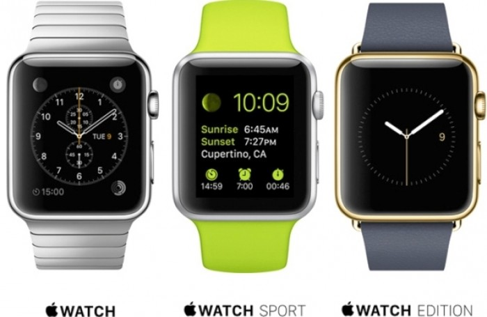
Apple unveiled their long-awaited Watch concept today and while I'll admit it has some cool features, I couldn't help but feel a little underwhelmed. Available in 3 separate options to cater to your needs, Apple Watch looks to not only integrate seamlessly with your fancy new iPhone, but also help promote a healthier lifestyle. The basic Watch model is your standard smart watch with various strap options which include some of Apples patented magnetic closures which is something I'm weary of while having a computer on my wrist.
With smart looking navigation apps as well as ones for email, music, pedometers and a new emoji communication tool, the Apple Watch can also control your Apple TV remotely or serve as a preview screen for your iPhone when taking photos with a timer. All of these, I admit, are very cool. The Watch Sport comes in a harder alloy case and sweat proof silicone strap, while the Watch Edition is your high-end model in 18k Gold with various luxury strap materials. There are several animated display faces to choose from, something I can see becoming a cool open source design platform to create your own watch face, but one of the things that was disappointing, was despite all this, the watch looked more or less how everyone expected it to. Just a smaller iPhone basically. Yes, the dial on the side which is used to increase the size of apps is cool and somewhat innovative, the whole thing just looks like every other smart watch already on the market that people aren't buying.
Will people buy this because it's from Apple? Certainly. But is it worth paying more for basically owning two iPhones? I guess we will have to wait and see. Apple Watch will come in a 42 and 38mm size and be available for purchase in early 2015 with a starting price of $350.


